Summary
The Pulse app plays a vital role in how students engage with Brightspace and D2L every day. This article explores a Pulse app UX redesign concept focused on better information architecture, stronger visual hierarchy, clearer progress visibility, and reduced scrolling fatigue. Inspired by curiosity and design thinking, this mockup reimagines course navigation in a way that feels more intuitive, efficient, and learner-centric—without dismissing real-world product constraints.
Table of Contents
- Improving Information Architecture in EdTech Apps
- Visual Hierarchy and Horizontal Course Navigation
- Making Learning Progress More Visible
- Reducing Scrolling Fatigue Through Smarter Layouts
- Related Queries Students and Designers Ask
- What This Means for Product Design Teams
- Final Thoughts on UX-Driven Learning Experiences
- Improving Information Architecture in EdTech Apps
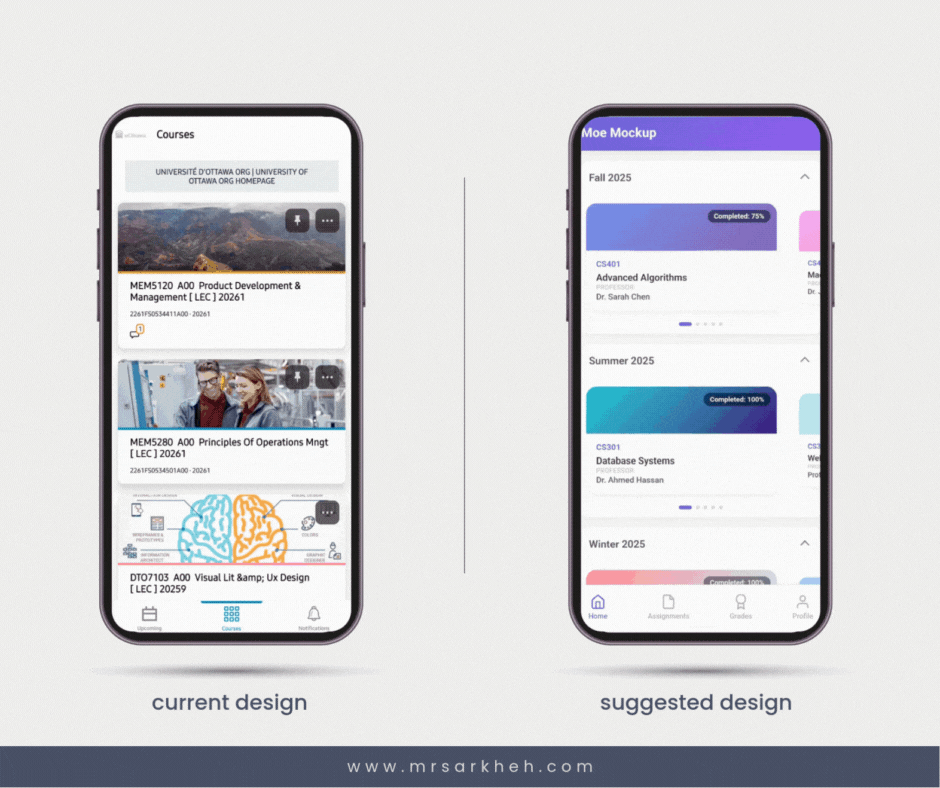
One of the biggest challenges in learning platforms is content overload. In this Pulse app UX redesign, courses are grouped by semester rather than presented as one long vertical list. This structure mirrors how students mentally organize their academic life, reducing cognitive load. Clear categorization helps users quickly find what matters now versus what belongs to the past. Strong information architecture like this is a foundational UX principle—and something we actively apply at Mimra Digital Solutions when building digital experiences for organizations across Fredericton, Moncton, and Saint John.
Visual Hierarchy and Horizontal Course Navigation
Instead of stacking every course equally, the mockup introduces a horizontal carousel that visually prioritizes the active course. This Pulse app UX redesign uses scale, spacing, and motion to guide attention naturally. By highlighting what’s most relevant, users spend less time scanning and more time engaging. Horizontal browsing also feels lighter and more modern—especially on mobile. At Mimra Digital Solutions, we apply similar hierarchy principles in data-driven UI projects for Atlantic Canadian businesses, ensuring users always know where to look and what to do next.
Making Learning Progress More Visible
Progress tracking is a key motivator in digital learning. In this Pulse app UX redesign, completion percentages are placed front and center on each course card. This makes progress immediately understandable without requiring extra taps. Small indicators—such as a red dot for updates or unread notifications—add another layer of clarity without visual clutter.
From a UX psychology standpoint, visible progress reinforces momentum and accountability. Users are more likely to return when they can clearly see how far they’ve come and what remains. This same principle applies beyond education. At Mimra Digital Solutions, we integrate progress visibility into marketing dashboards, funnels, and customer journeys for New Brunswick businesses—because clarity drives action, whether you’re completing a course or converting a lead.
Reducing Scrolling Fatigue Through Smarter Layouts
Endless vertical scrolling can be mentally exhausting. By enabling horizontal navigation within categories, this Pulse app UX redesign reduces repetitive motion and creates natural stopping points. Users can explore content in smaller, more manageable chunks. This approach aligns with modern mobile UX trends and improves long-term usability. It’s a reminder that good design isn’t about adding features—it’s about removing friction. That philosophy guides our UX and branding work at Mimra Digital Solutions across Atlantic Canada.
Related Queries People Also Searched For
- Why organize courses by semester?
It matches real-world mental models and improves findability. - Is horizontal scrolling bad UX?
Not when used intentionally with clear visual cues. - Do progress indicators improve engagement?
Yes—visible progress increases motivation and return usage. - Are redesign concepts criticism of existing products?
No, they’re exploratory and respect real-world constraints. - How does UX impact learning outcomes?
Better UX reduces friction, letting users focus on learning.
What This Means for Product Design Teams
This Pulse app UX redesign is a reminder that even small experiments can spark valuable conversations. Thoughtful design explorations help teams question assumptions, test alternatives, and refine user experiences over time. At Mimra Digital Solutions, we take the same curiosity-driven approach—researching UX, branding, and AI-powered tools to help businesses in New Brunswick make smarter, data-backed design decisions that scale.
To wrap up…
To wrap up, this Pulse app UX redesign isn’t about declaring a better or worse solution—it’s about exploring possibilities. By improving structure, hierarchy, and feedback, digital products can feel more human and more intuitive. If you’re a business in Atlantic Canada looking to rethink your digital experience, Mimra Digital Solutions is always happy to help you design with clarity and purpose.
Want more insights like this?
👉 Sign up for the Mimra Digital Solutions newsletter for UX, branding, and AI-driven marketing insights.
👉 Request a free consultation with our expert team.
👉 Let’s improve your brand and sales funnel with a data-driven digital strategy built for New Brunswick businesses.


